Embarq
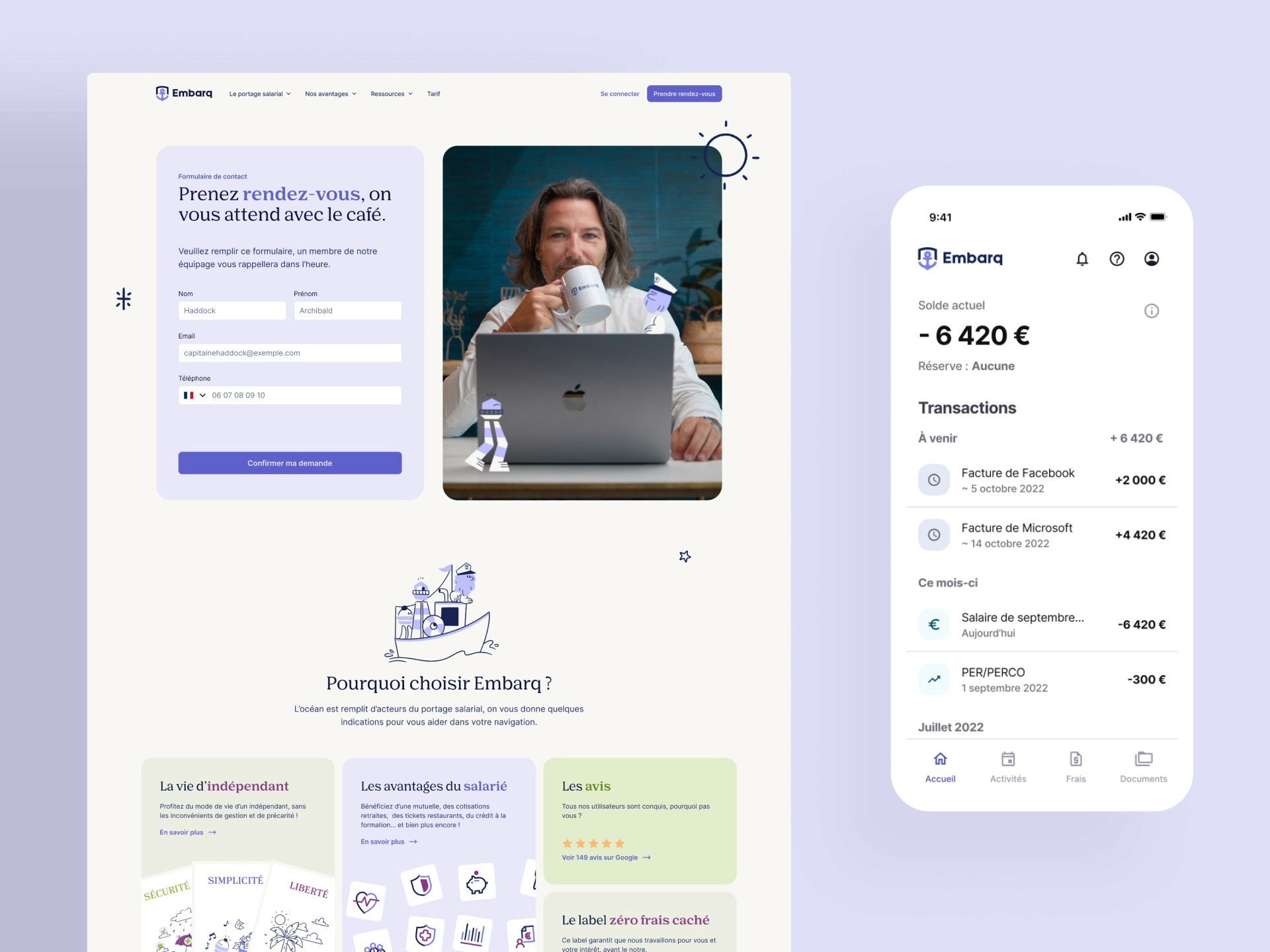
Embarq is a B2C administrative service, it acts as a contracting intermediary between independents and their clients, allowing the former to have social coverage that wouldn’t be normally granted otherwise.
Embarq is definitely the best at this job in France. See what their users think about the service.
They combine an extremely professional service and a highly motivated team composed of kind-hearted people, which now transpires well into their branding.
They have a very transparent pricing, that allows them to own their clients’ trust and never compromise in the quality of service.
The business was bootstrapped from the start which means there is no doubting their market-fit, and they are not tied by VCs into making decisions for the next big round to come.
There is too much to say about Embarq since I have been their principal designer dating early 2020, shaping their first application, both desktop front and back offices, mobile application and website.
History of work
New branding update on apps
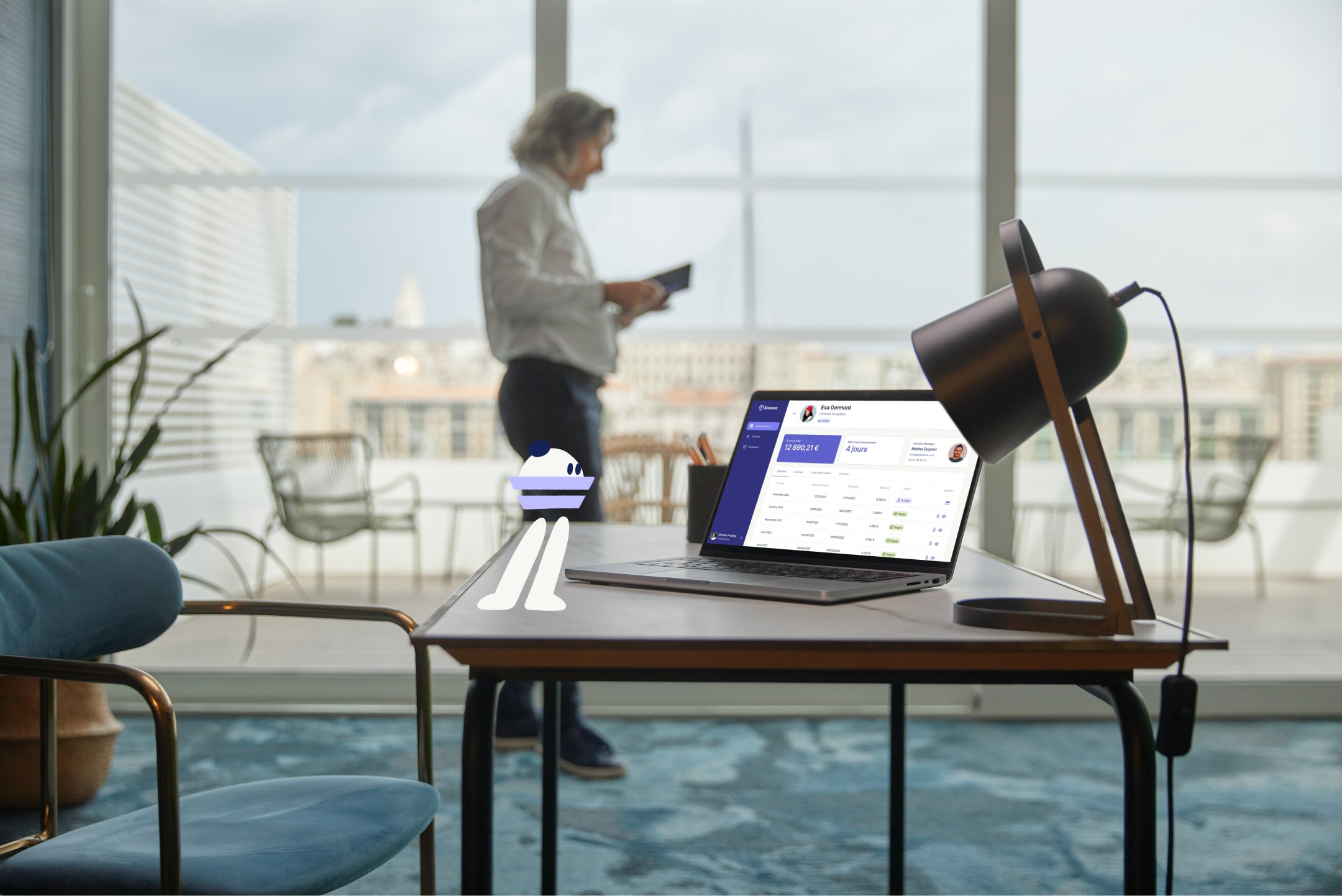
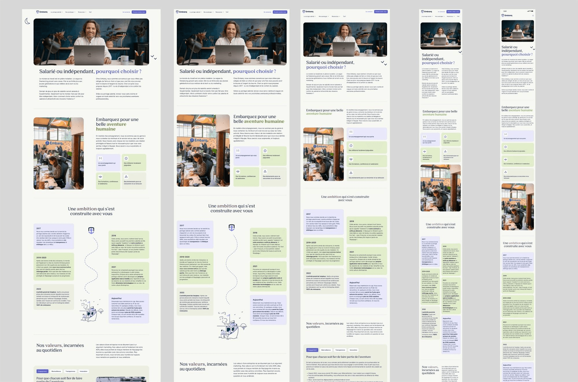
Q1 2024: New brand and website
Problem
Content was old, brand was missaligned with users’ perception, developers didn’t have enough time to tend to marketing issues on the website, critical acquisition touchpoints like a salary simulator needed to be heavily updated. The brand globally lacked coherence and wasn’t memorable enough.
Solution : Rebranding and website redesign
I worked in collaboration with Bison Bleu a talented creative studio in Marseille. Here’s how we split the work:
Bison bleu: Art Direction, branding, illustration & motion, copywriting, photography and video shooting+editing.
Spellbind.me: Web design and webflow development, along with some project management, content creation and webflow courses to hand-off the website to marketing teams.
Main challenges:
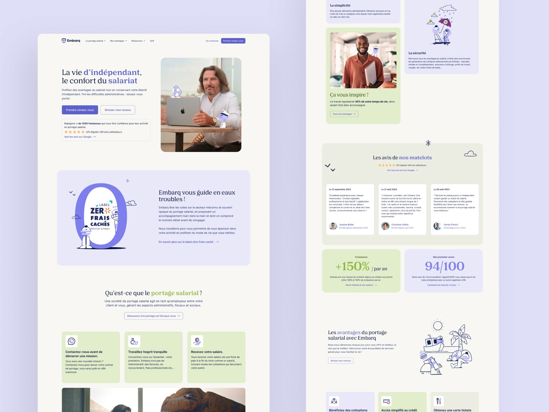
Brand alignment: Expanding branding guidelines made by Bison Bleu to an entire custom website, without ever compromising the quality of brand expression.
SEO Performance: Sitemap, HTML architecture, contrasts, image compression and video loadings have to be optimized to get the best possible score.
Factorization: The website has a lot of content (mostly for SEO), which had to be factorized into components to speed up development and ensure consistency.
Migration: I had to migrate 1500+ blog articles from Contentful to Webflow, which was a very heavy process of exporting CSVs, reformating them and adding new contents to the collection that was compatible with the new design properties.
Redirections: A lot of URLs were incompatible with the old website architecture (a lot of static hyperlinks), meaning I had to create more than 800+ 301 redirections to ensure users get the content they’re looking for when jumping from an old link.
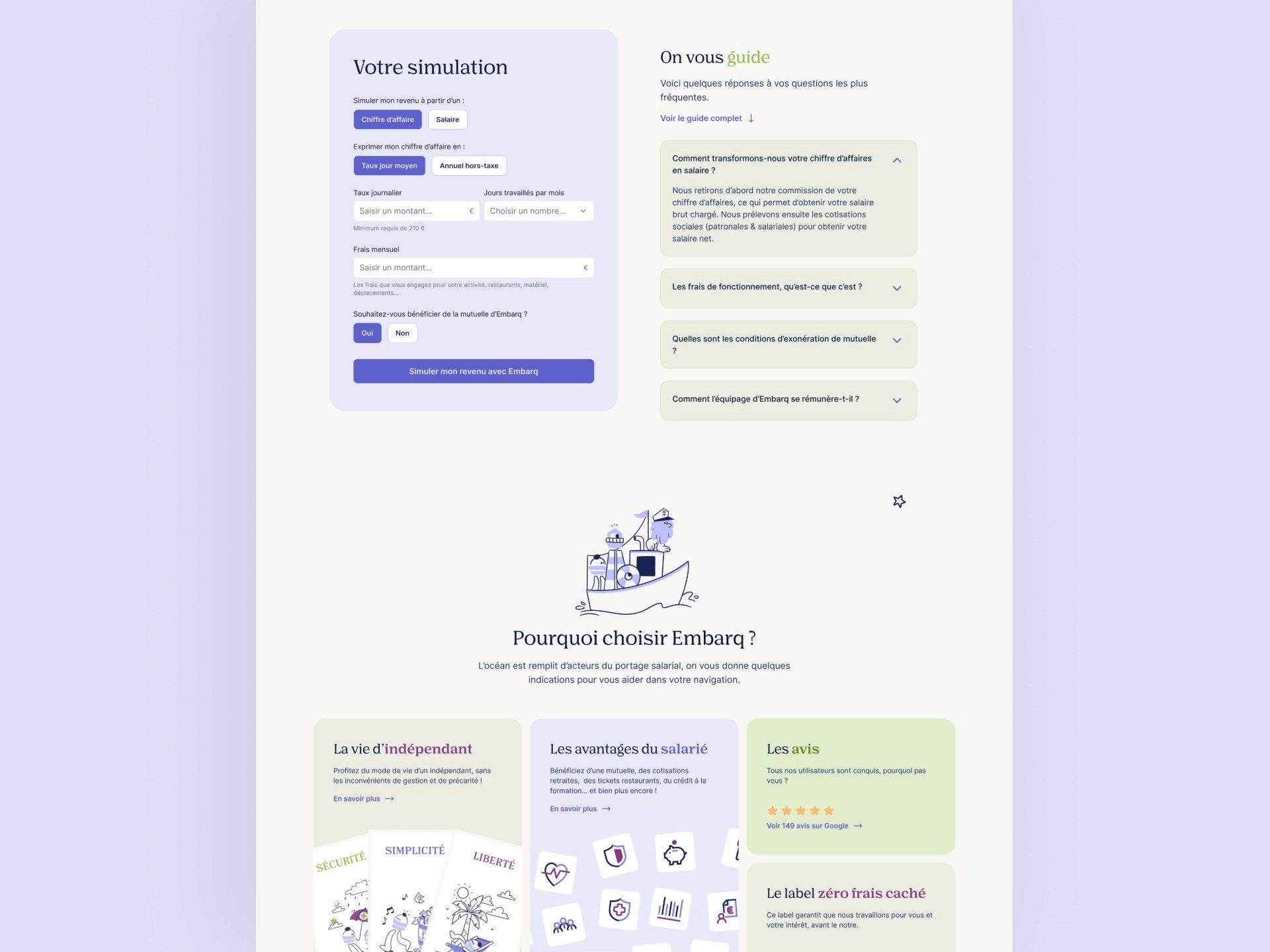
Custom code: I had to connect a simulation tool to an external API using custom-code and display results immediately, which is not natively allowed by webflow logic.
Custom flows: I had to create custom logic flows sending formatted emails to marketing teams and allowing them to use their prefered CRM Hubspot to dispatch leads.
Hand-off: One of the key objectives was to hand off the website to the marketing team so they could keep on adding content, and make simple landings without calling for any expert. Therefore, I followed client-first convention, which allows to easily recognize factorized blocks (kebab-case) from specific ones (snake_case) and thus avoid making any mistakes when using the webflow designer mode. Client-first is also a set of great CSS practices to ensure CSS quality and readability.
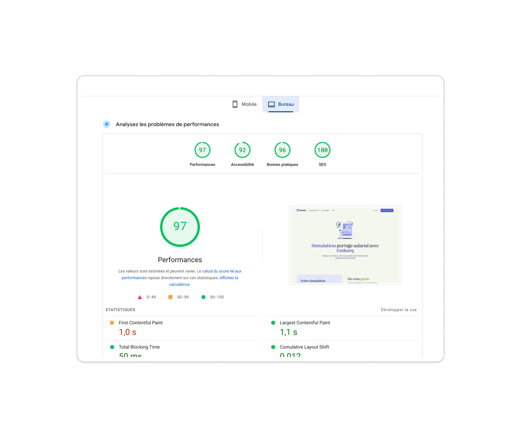
Performance impact:
Website released late january 2024
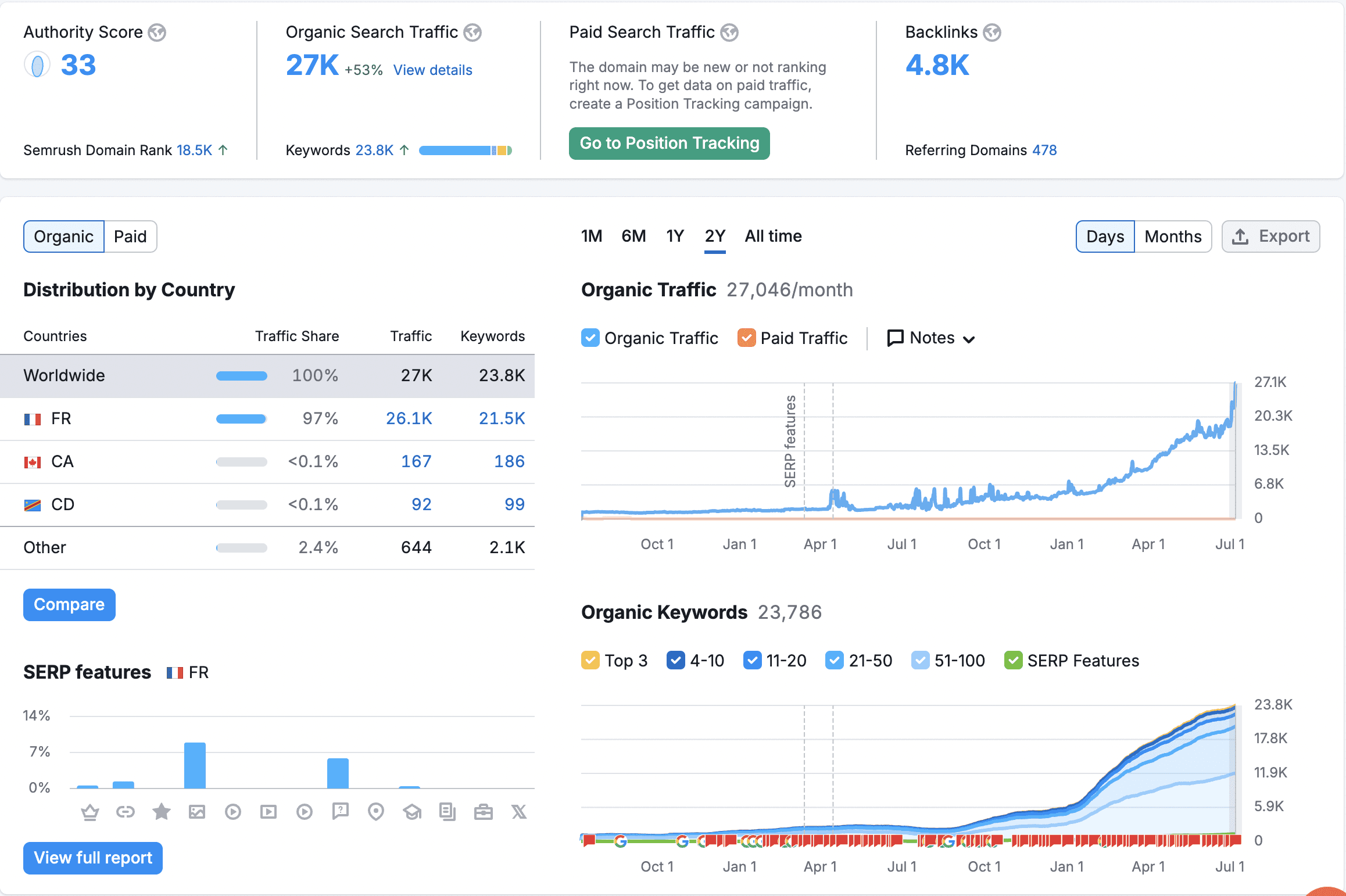
Very good SEO lighthouse scoring, especially on CMS pages
Boosted SEO ranking and traffic (check the bump around mid-february, it's huge!)
Boosted user traffic and lead-making, with at least 40 salary simulations made per day
Marketing impact:
Every touchpoint on the website is treated on their CRM, maximizing conversion rate
Better brand consistency, allowing for easier content creation by marketing team
Marketing team leads the whole website administration, and is able to create simple landings from existing blocks
Check the live website: https://www.embarq.fr/
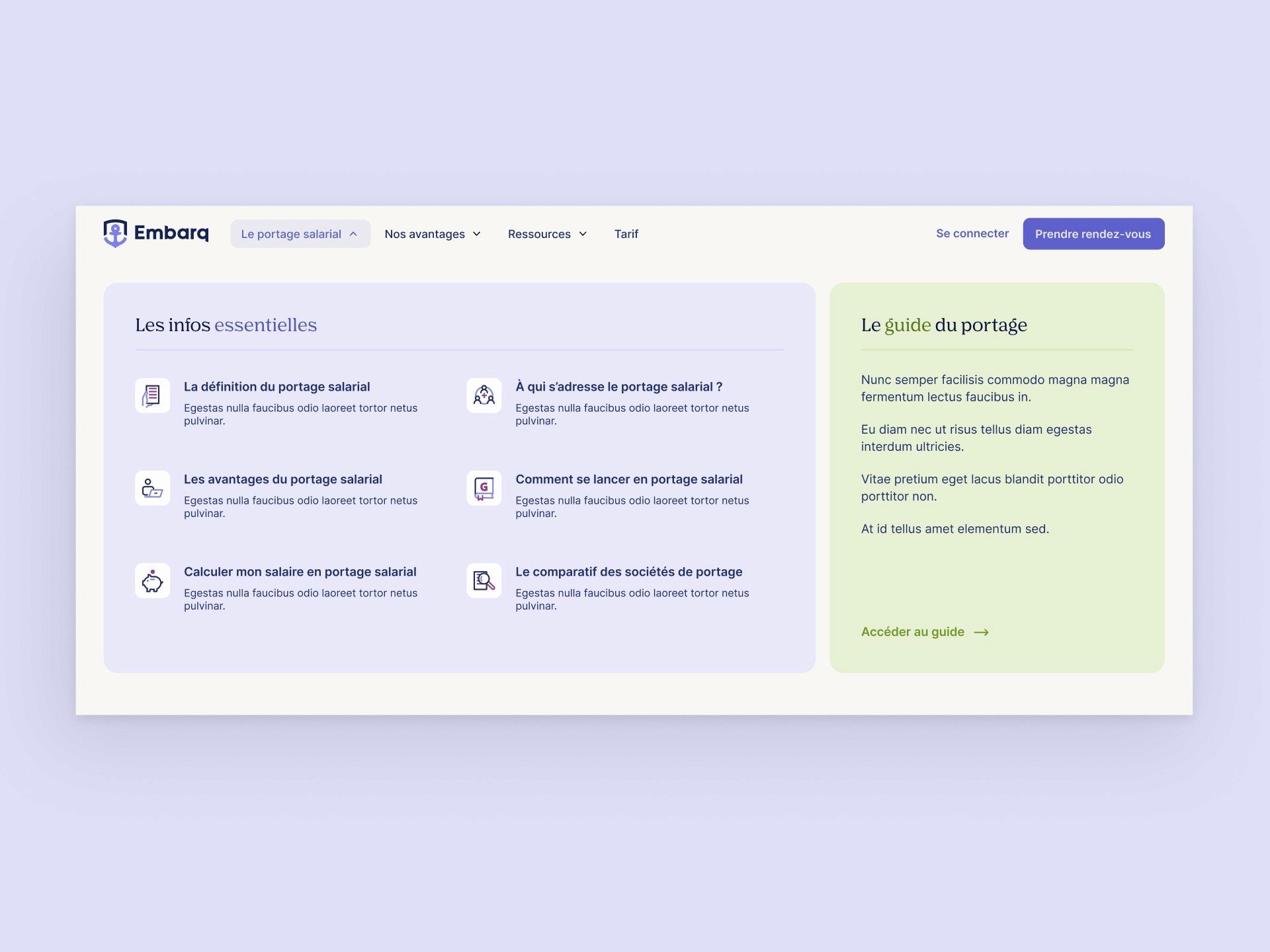
Navigation
Simulation bloc and interactive bento grid
Custom design 100% made in Figma and entirely responsive
Promotional video made by Bison Bleu, copywriting by Spellbind.me
Q2-Q3 2023: Creating Billi.so
Embarq together with my developers partners at Qraft have started a new SAAS called Billi.so, capitalizing on years of knowledge in the intermediary business. I designed it entirely and invite you to check it out here. Read the usecase here
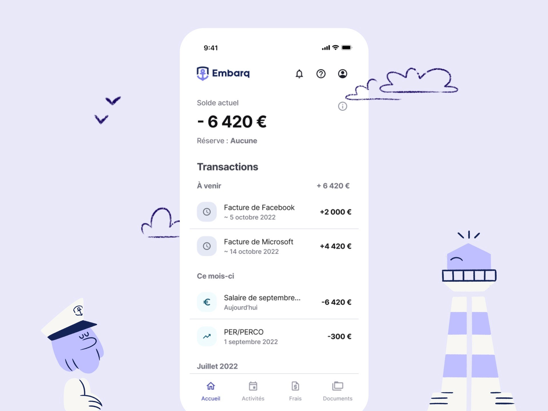
Q3-Q4 2022: Embarq mobile app (cross platform)
Problem
Web platform is less accessible for users to declare their activities, which in turn creates a lack of user engagement. Same idea for bill declaration, taking a picture with your phone and sending it to your computer is a less engaging experience than doing everything on one device.
Mail notifications are less incentivizing and direct than push notifications
Objectives
New acquisition canal
Facilitate user experience
Drive user action and engagement, which in turn makes back-office administration a lot easier
Constraint
Cross platform in React native
Material design system to follow initial desktop philosophy
Design methodology
Definition: Problems to solve, business objectives, KPIs, tech constraints, schedule…
Functional documentation: Definition of user journeys including flowcharts and push notification structure
Navigation architecture
Wireframing
UI design using Google Material You token architecture (one of my favorite for its simplicity)
Prototyping to get a full overview of the navigation

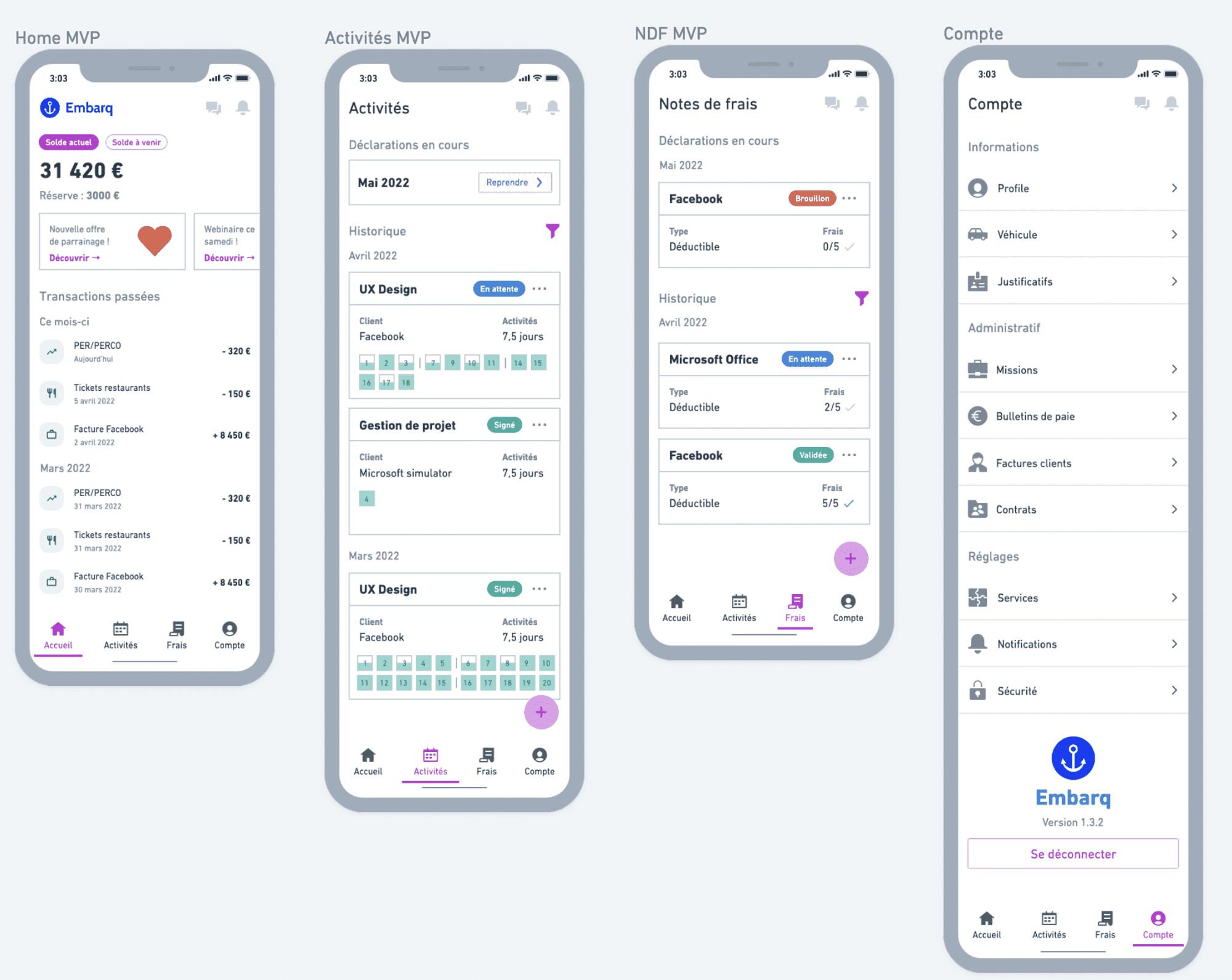
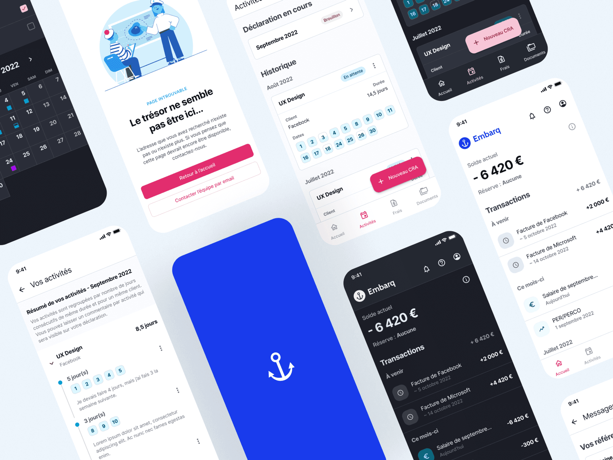
Front and Back office Q1-Q3 2020
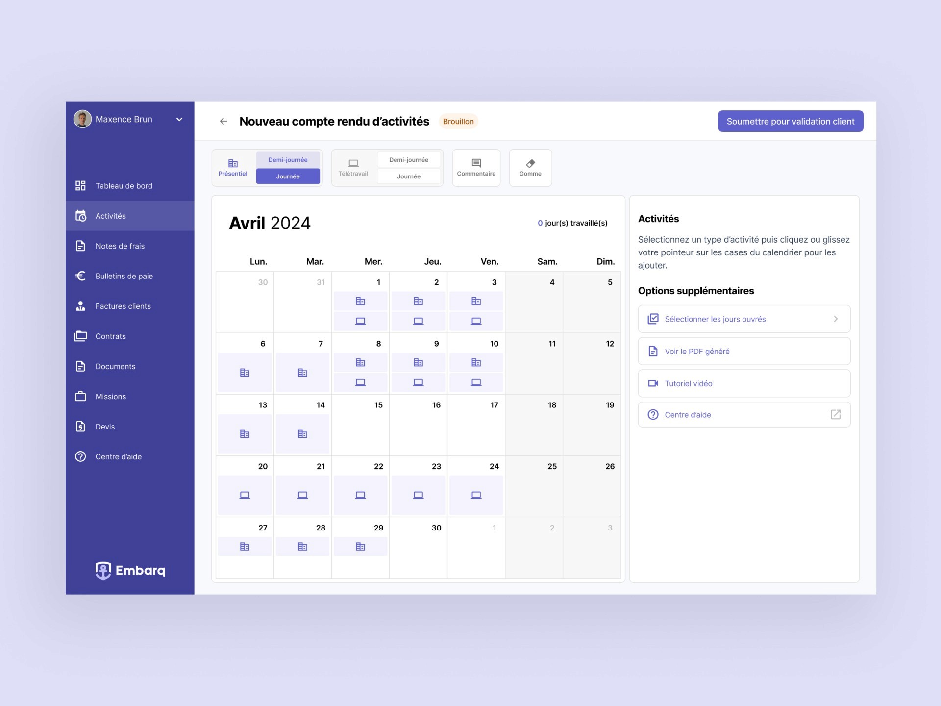
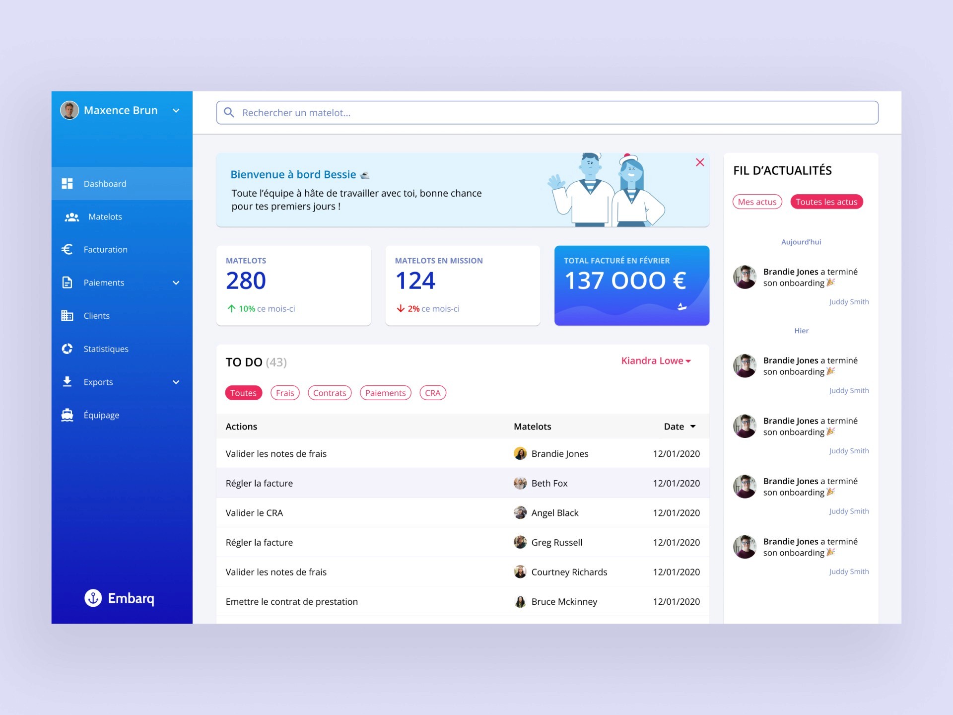
I’m writing this in 2024, meaning I don’t have much archives except for memories of countless hours of call with Clément (CEO @Embarq) to correctly layout the service map and turn it into an intelligible interface. Like other designs I made, we did hundreds of iterations before getting a satisfying interface for both administrators and end-users that would use the front-office.
Business impact
The interface allowed the team to stay agile and small in comparison to the volume of business it is dealing with. It gave Embarq a sharp edge over competition (often old institutional services) when it came to brute productivity and scaling potential.
Here’s a glimpse of how it looks like “now” in mid-2024:
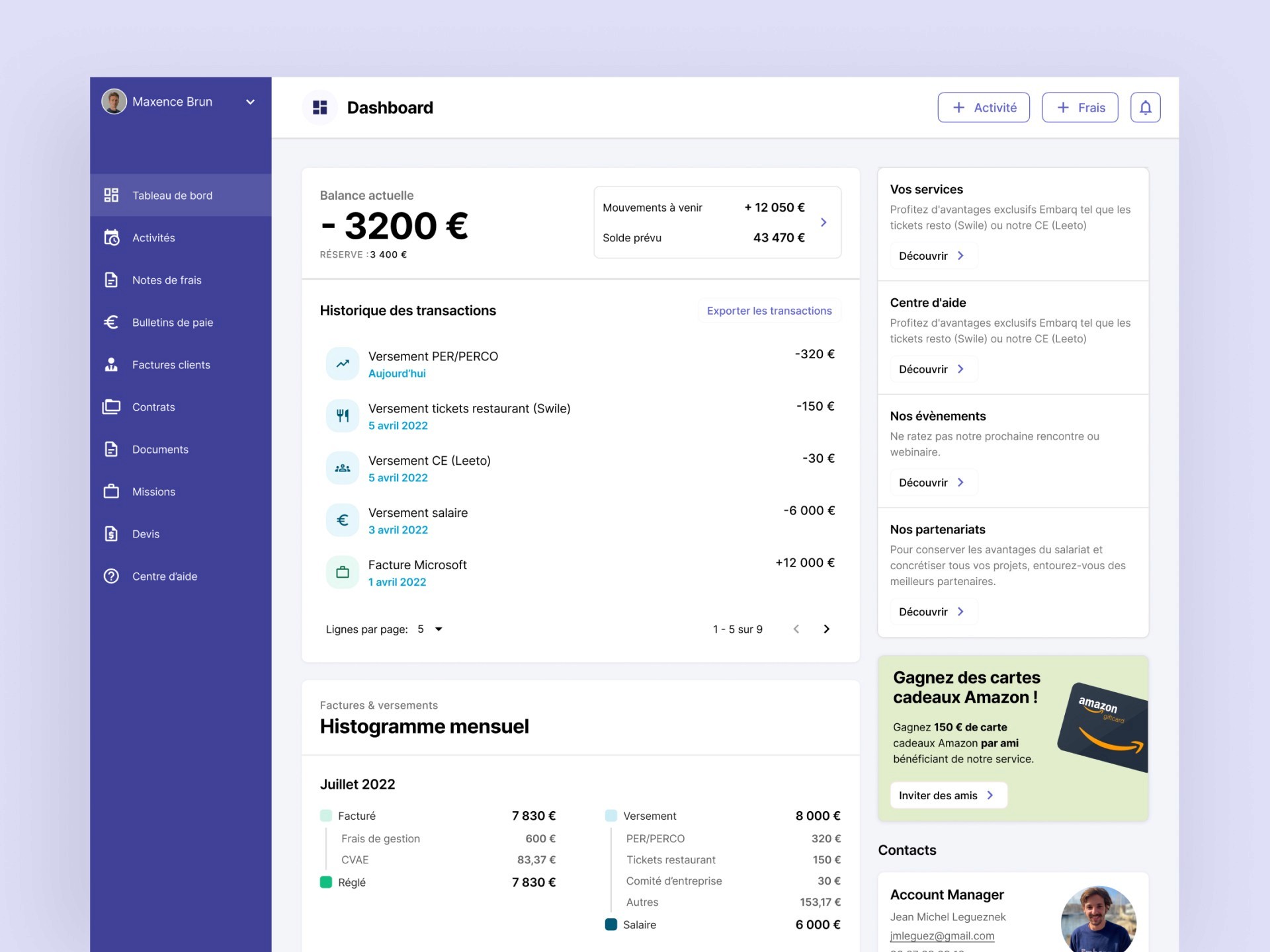
Here’s how it looked like when we started in 2020:
Thanks for reading all the way!
Project details
AdministrationMobile appDesktop appBack office
