Backupta
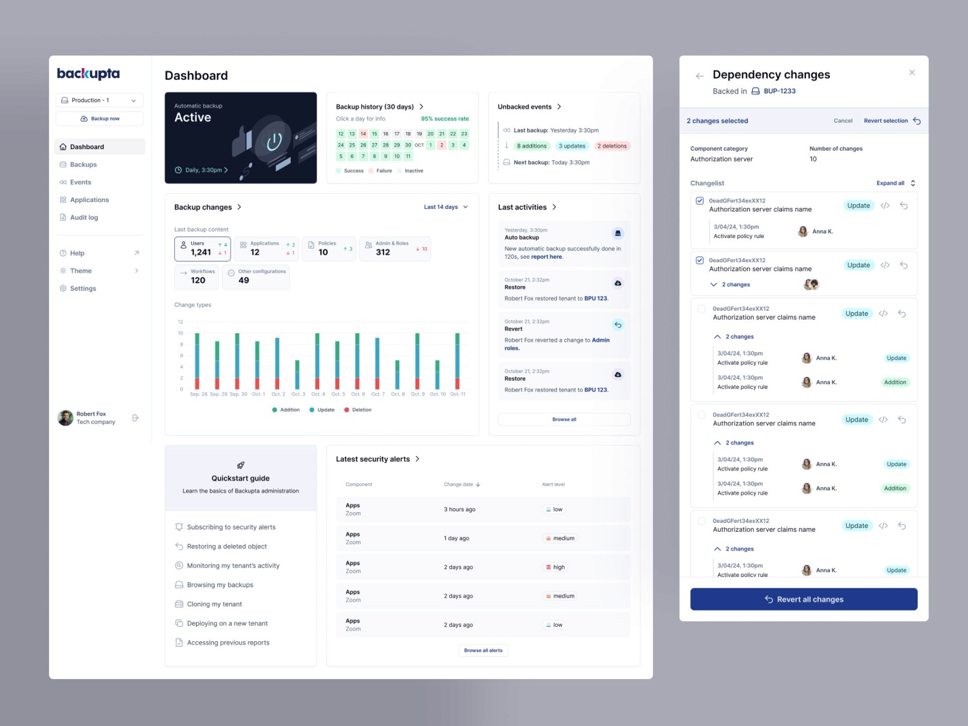
Backupta is a backup and restore platform for Okta SSO identities. It protects businesses against human errors or potential threats to their data, by giving them a mean to understand changes, and rollback their tenant (server) at any given point in time.
Initial brief
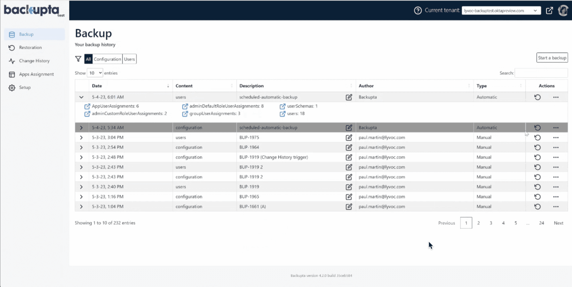
Backupta already had a functional user interface but faced multiple problems:
The interface looked ‘old-school’ which didn’t really entice potential leads to convert to customers
Product demos to clients started to get messy because the interface was too dense
UI was not on-par with latest SAAS designs, which would have been a marketing issue at the annual Oktane conference. Appearances matter.
Developers started to have a hard time organizing new features and screens, spending too much time improvising design
Lack of coherence in user interactions
Here is how the interface used to look:
Design Solution
UX - Rework the interface ergonomics:
Information architecture
Simplify and clarify user journeys to quickly find the desired information
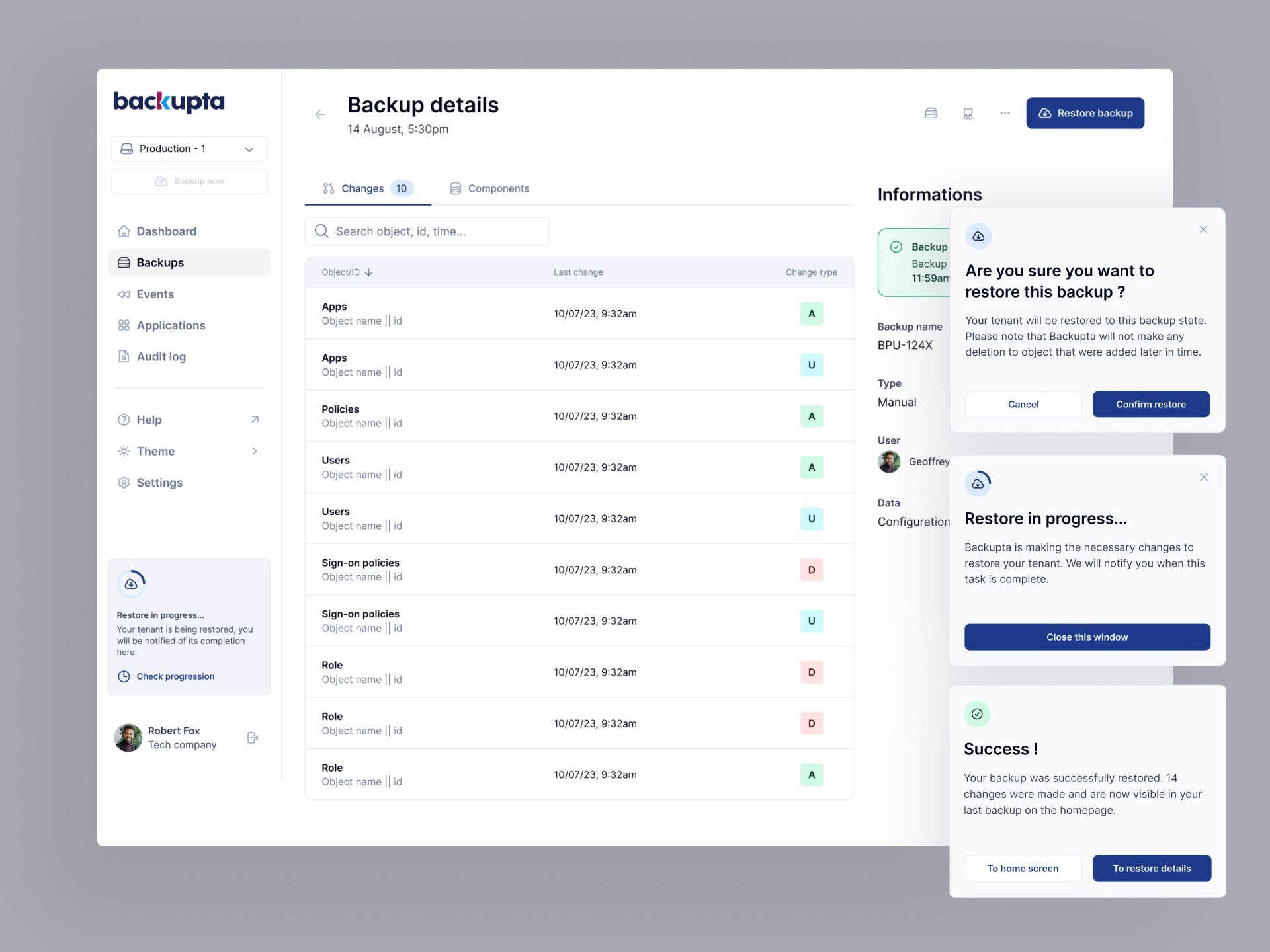
Clarity of system states: loading, errors, backup feedback
UI - Make the platform more visually impactful for prospecting and user comfort:
Current accessibility standards, texts, colors
More easily distinguishable visual codes
More modern and professional style: typography, spacing consistency, components, and interactions
Establish visual coherence for future developments → Mini design system / UI kit
Create a playable prototype for prospection purposes
Design methodology
Definition of value proposition, personas, redesign mission objectives and constraints
Audit of the existing platform to empathize with users
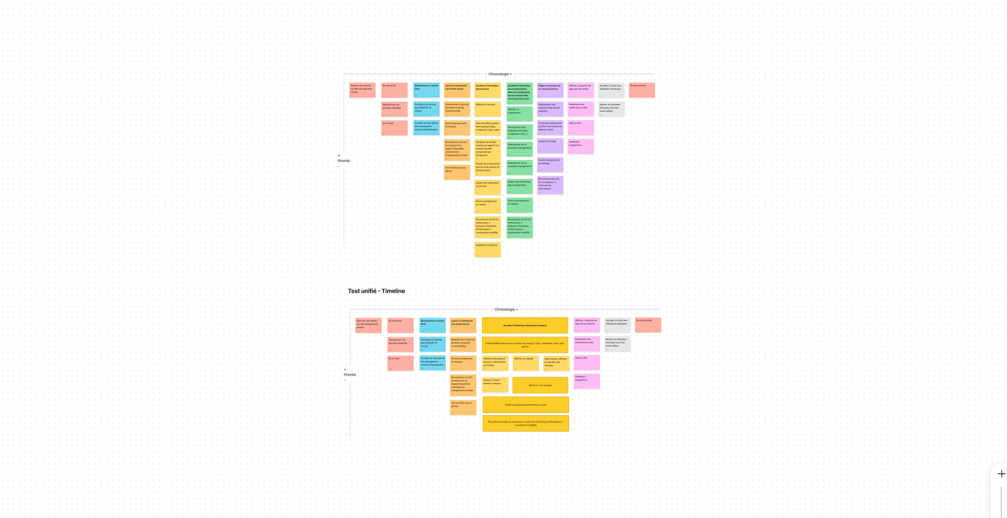
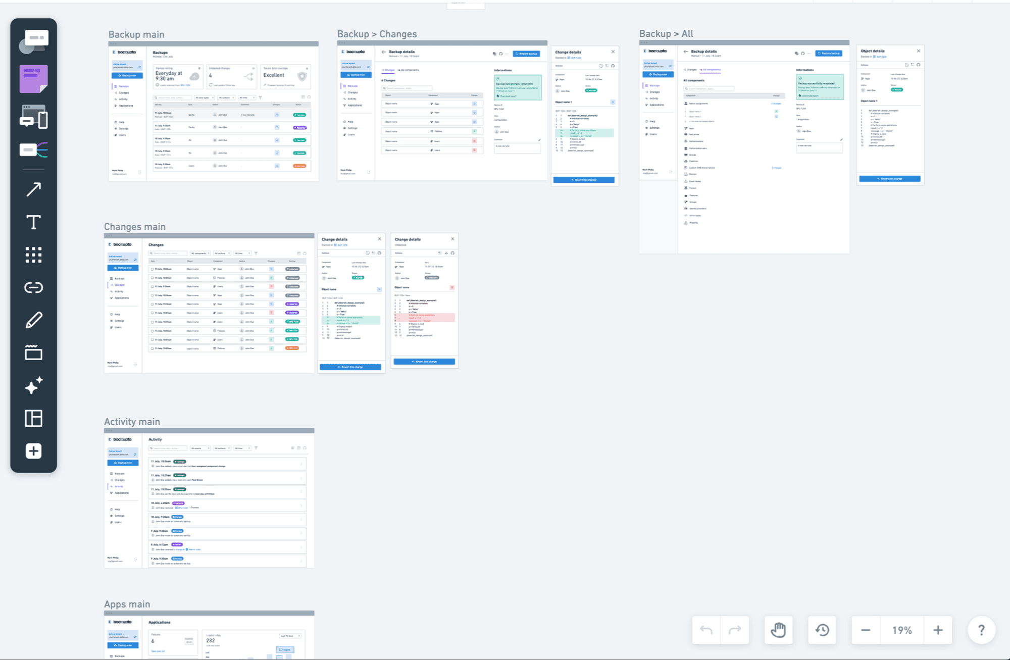
Story mapping and reorganization of all existing user stories on the platform, to get a clearer picture of all product functionalities to implement in the redesign
Iterations of wireframes
Moodboard to get the whole team to stick to a single vision
Figma UI prototypes
Challenges
Inherent service complexity: Backupta is a service used by Okta administrators for complex SSO data-tempering tasks, which means I had to deeply understand all usecases they face. It has a lot of similarities with dev project management using git: having a front-end background really helped. To achieve a deep degree of understanding, I made multiple interviews with the CPO and CTO, gathering their product knowledge and user feedbacks.
Controlling development complexity: This was addressed by carefully building new design foundations on top of Tailwind CSS, allowing developers to easily access CSS classes and use pre-made components available in the library as much as possible.
Asynchronous interactions: Many interactions on the application, such as server cloning, server rollback, and restoration, are asynchronous. This means that the user needs to be able to track the progress of these various tasks without being blocked from browsing the rest of the application. To meet these requirements, some components have been specifically designed to be prominently present in the application's navigation.
Impact
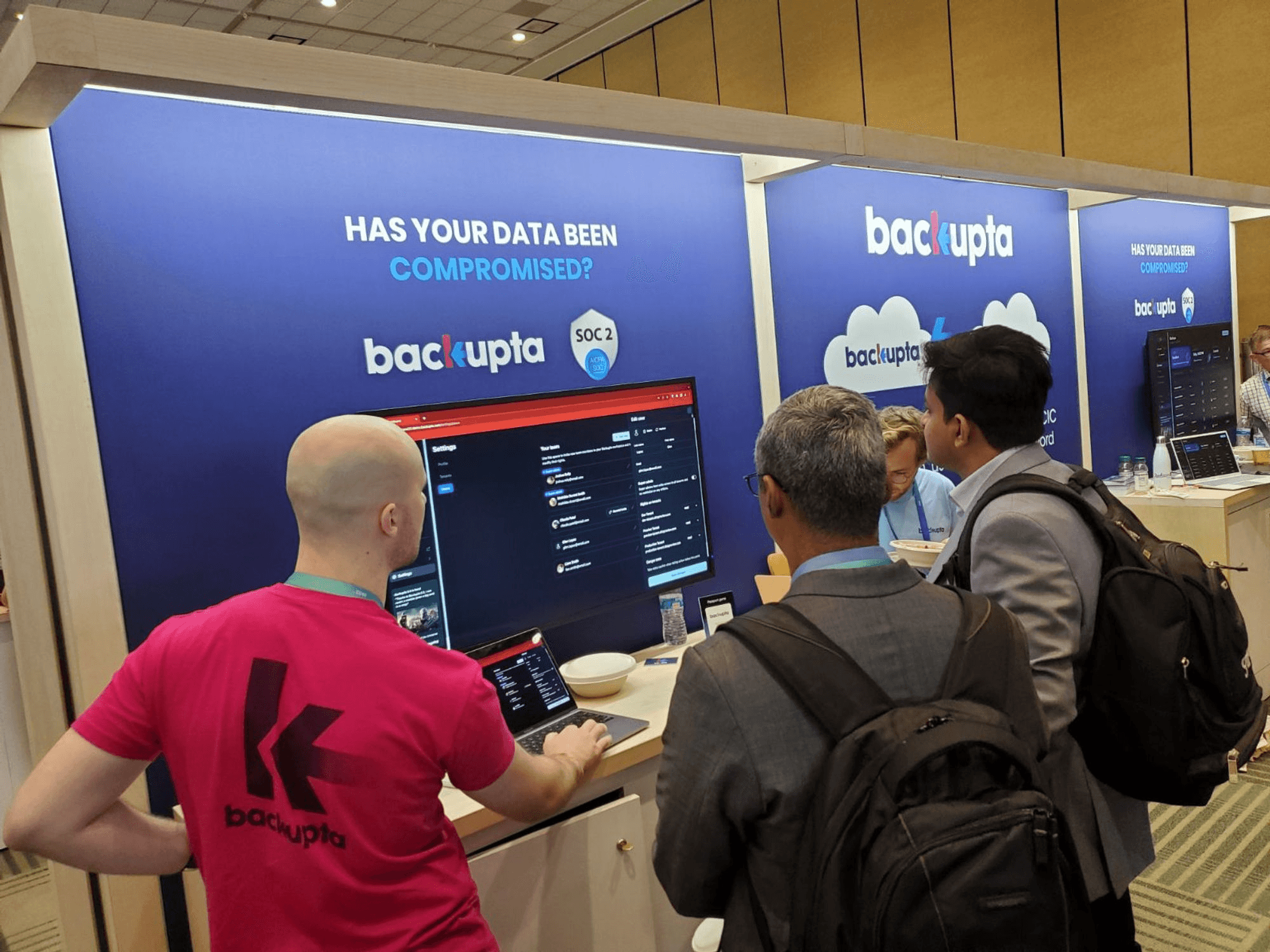
Redesign and development was done perfectly on time for Oktane conference. Backupta’s CPO was also able to make product demos using the Figma playable prototype, which allowed to make new business deals before development was complete. Backupta is now on the right tracks to keep on scaling in Canada, USA and France.
They made quite an impression at Oktane :
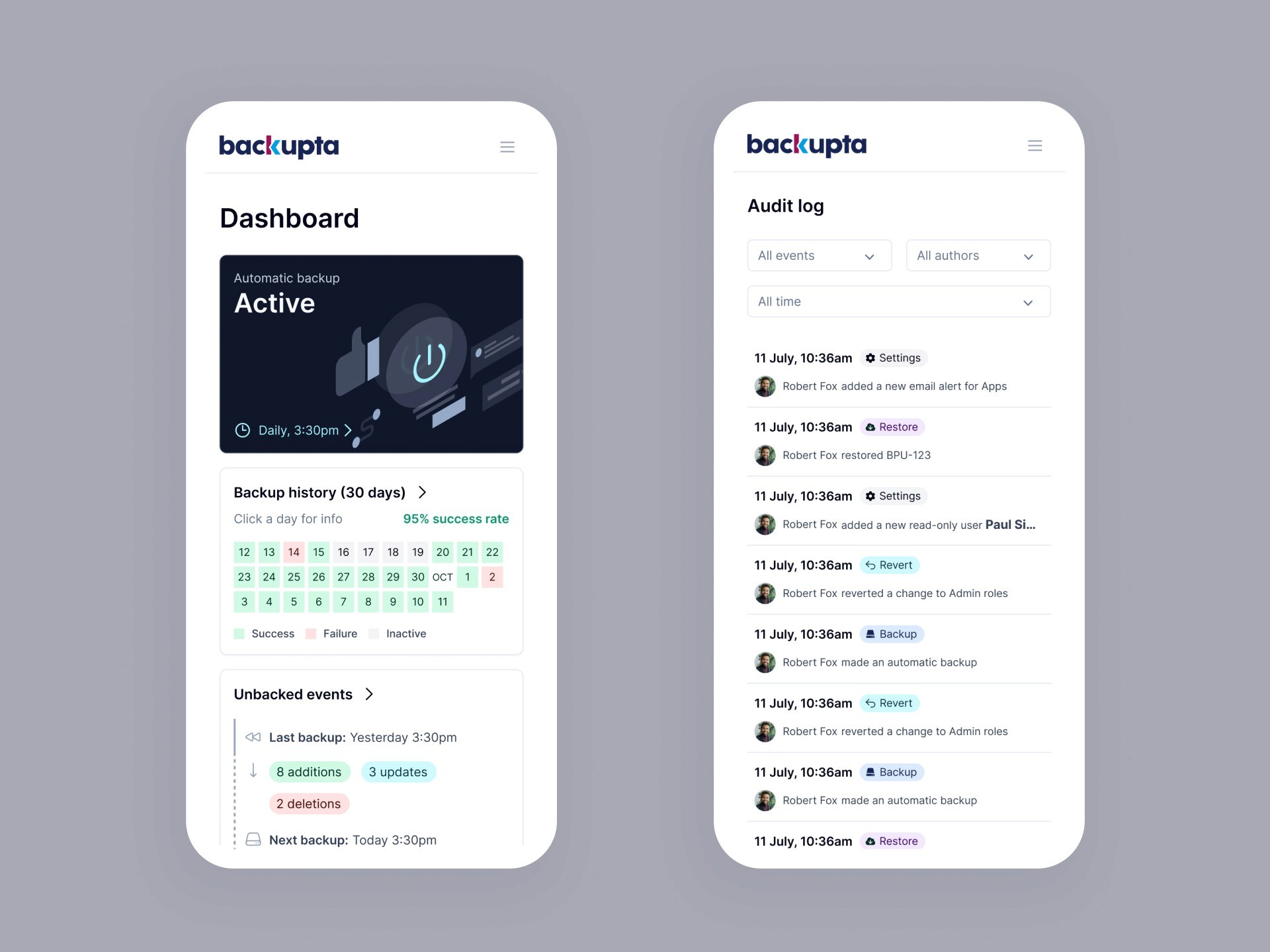
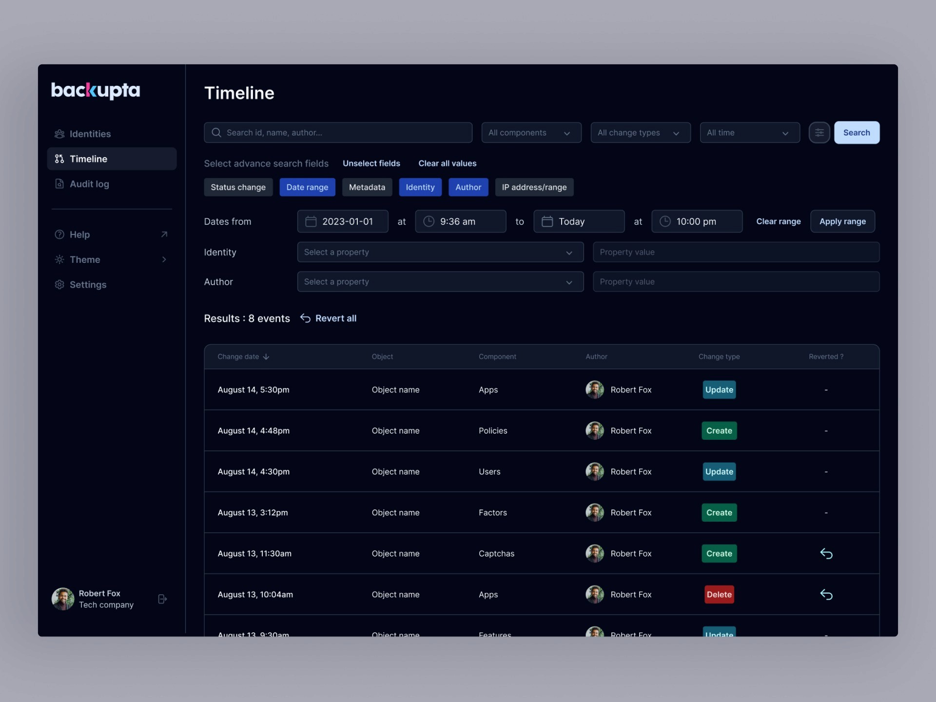
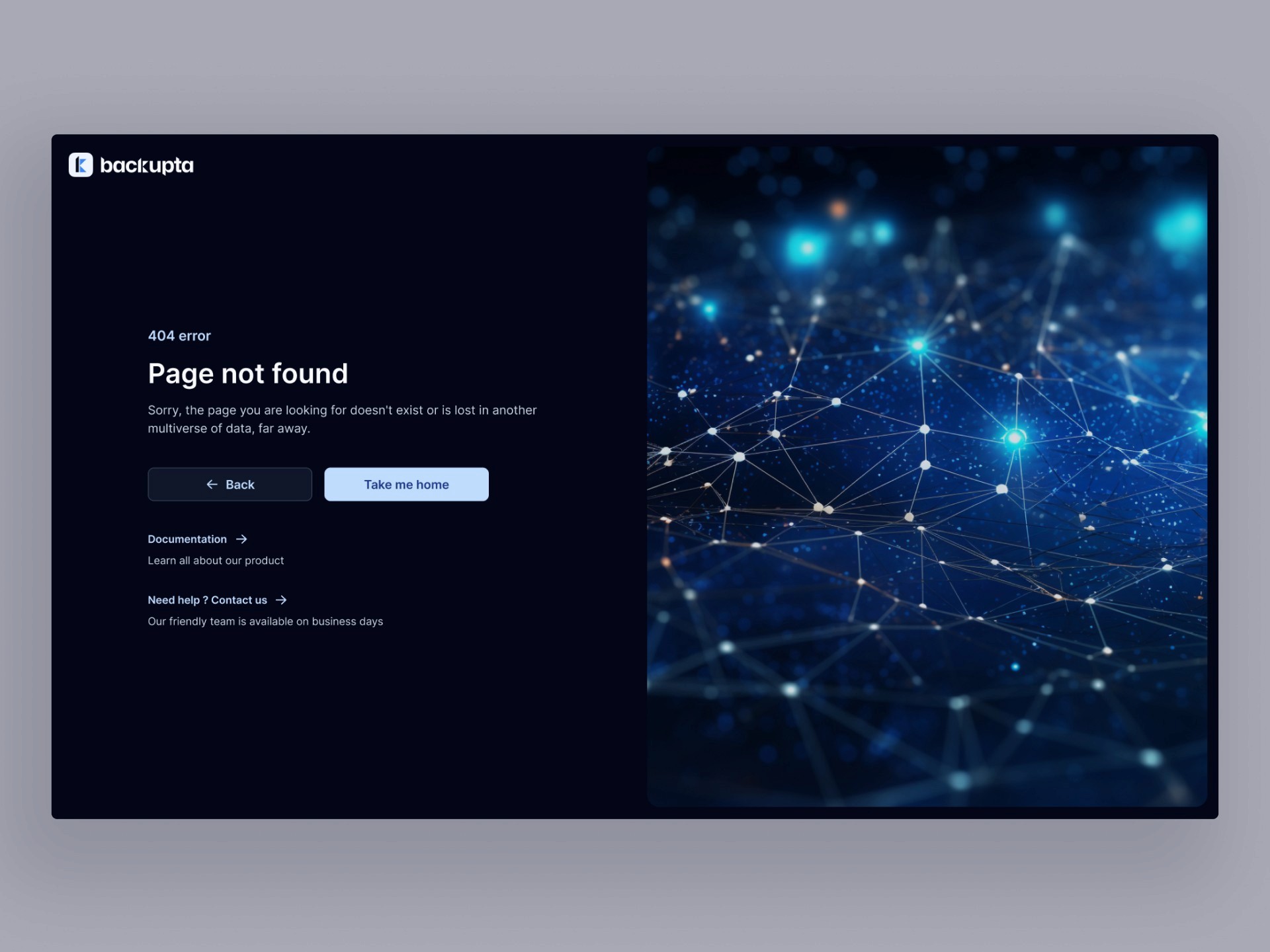
Here are a few screenshots of the process and final result:
Thanks for reading all the way!
Project details
SAASCloudOkta addonData administrationLinks
